Emacs Themes: My Journey
Introduction
I have used Emacs for a long time (since version 21), and it occupies the vast majority of my screen time, when I am not playing a video game. Naturally I am very picky about how it looks and feels. Theming is a big part of it.
Deviant
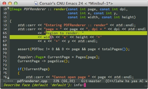
Deviant was the first Emacs theme I made. It was initially for a mode called color-theme. That mode existed because Emacs did not have built-in theming support until version 24.
The Deviant theme was inspired by a website called “DeviantArt”, which was a big community for indie artists. That website went through a few redesigns later, so you would not find the inspiration in today’s version. But back then it looked like this:
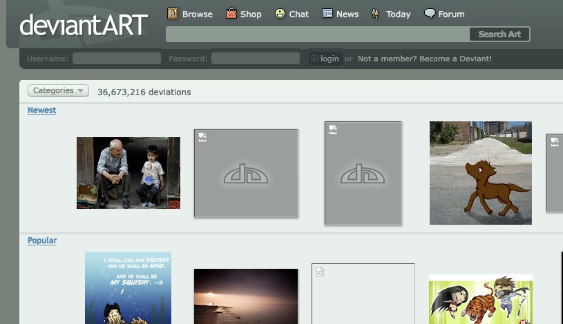
That very particular yellow color for the region face is not visible in this screen shot, but you can see it in their sprite sheet:
![]()
Otherwise this was just a pretty normal theme. I used it for many years. Later I ported it to Emacs’ built-in theme system. The code is still here, but I do not maintain it anymore.
FlucUI
Eventually I got bored of the Deviant theme, and was looking for inspirations for my next theme. And something happened in the realm of UX design: iOS 7. Very quickly flat UI design became the trend, and every tech company was redesigning there UI to be flatter, dumber, less discoverable, and harder to use.
If you were one of those designers you might have used a website called Flat UI Colors. Today if you go to the website, you will find that it hosts a number of different color palettes. But back then it just had one palatte, which today they call “Flat UI Palette v1”. I decided to use it as the basis of my new theme. I called it the FlatUI theme. [code]
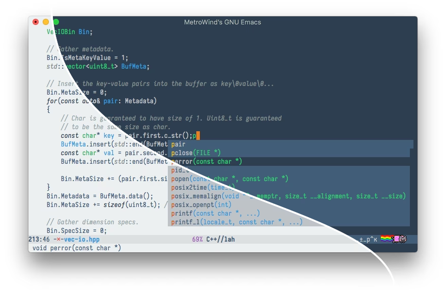
As you can see I also decided to include both a dark variant and a light variant. And I used both. I was pretty happy with it. At some point I decided to put it on melpa. But there was a problem: there was already a theme named “FlatUI”, which was also based on flatuicolors.com. It looked very different though, so that was not as embarrassing as you might think. Either way, I needed to change the name. After some thinking I decided on “FlucUI”, as in “it is not flat; it has fluctuations.” 🤣
Lab
Eventually I got bored of the FlucUI theme. And I realized some problems specifically when using the palette for a text editor: some colors are more vibrant or brighter than others, and therefore they attract more attention. Specifically the green color was one of the culprit of this. However it was a really minor issue; 90% of the time I would not be bothered by it. But I could not help but think if there was a way to fix it. And of course that meant I needed to create a new theme.
For this new theme to work, I needed to find a way to generate a color palette, where all the colors have the same perceived saturation and brightness. A RGB color space was not suitable for this, because there was no easy way to find a color that was the same saturation and brightness as another color, but in a different hue. But there was a color space that was supposed to be good at this, which was the CIE LAB space. Unlike the RGB space, one of the channels in LAB is specifically for brightness (lightness). If I have a fixed lightness, no matter how I change the other two channels, the color should maintain a similar perceived brightness level. And this is exactly what I did. I wrote a Mac app (because Mac had good color APIs) to pick color in LAB space.
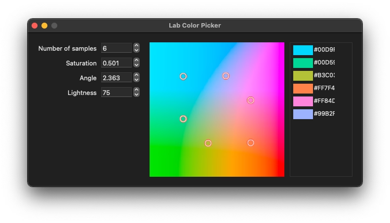
Basically the way it worked was I could specify a lightness, and the app would show the other two dimensions on the window, much like the color picker in Windows. I could click on it to select a color, and it would then pick and show another five colors, according to a pattern. I then hard-coded these colors in Emacs. And thus, the Lab theme was born.
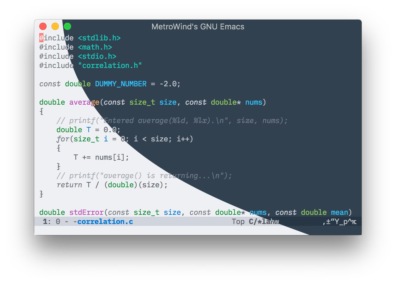
As you can see, it looks fairly similar to FlucUI, but more uniform in colors, which, to me, was a success.
At this point, I should address a point in theme-making, which may not be apparent if you have not made a theme (but should quickly become apparent once you start): even though the light variant and the dark variant share the same set of color hues, apart from the background and regular text color, it is really not a good idea to reuse exactly the same colors in both variant. For example, suppose we decide to use blue for strings; it would be much better to use different lightness of the same blue in light and dark variant, otherwise there would be readability problems. Luckily this was extremely easy to do in the LAB space. It was just a matter of changing the lightness value. Overall, I was very happy with the Lab theme.
NotInk
But eventually I got bored of it. The Lab theme did not really have any problem, but that was the issue --- it was fault-less to the point of being boring. I needed a new theme; something different. Then I had an idea: could I make a grey-scale theme that still works? After some tinkering, I came up with this:
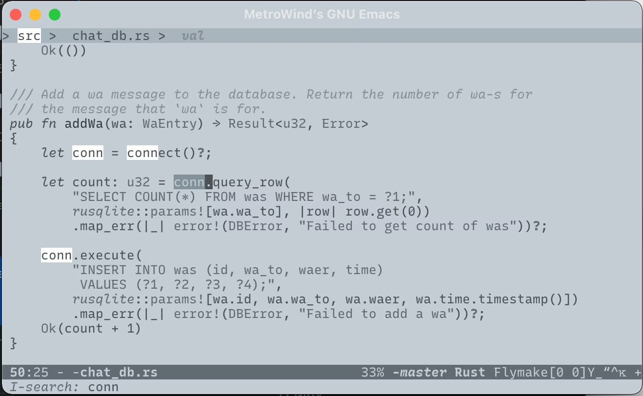
This is not my original color scheme. I stumble upon a trading website that had a similar color scheme for their charts, so I stole some of the colors. The intention was to recreate an e-ink-like appearance. All the colors in the palette look like some kind of grey, but if you take a screenshot and check the colors, they are actually blue. The background, for example, is #c4cdd3. But if you just look at it, it is grey.
The whole idea of creating a greyscale theme was just a joke in the beginning. After all the ultimate purpose of a theme was to differentiate the various syntax elements in order to improve readability, and a greyscale theme seemed to be anti-productive in that regard. However, I was really surprised by NotInk. Not only did I almost never have problems telling apart the syntax elements, I also found it extremely pleasing to look at, and easy to the eyes. Who could have thought! This quickly became my favorite theme (still true even now).
Random Theme
I stayed on NotInk for longer than I was willing to admit. Again it was a surprise success for me. But eventually I got bored. However, this time I truly ran out of ideas. I have tried color palettes from others, I have designed my own color scheme, I have created a greyscale theme. What was there left to do? The real problem was that I got bored of the “eventually I got bored” part. What could I do to not get bored?
Oh I know, use a different theme every time!
Naturally the idea was to pick a random theme at start up. Emacs provides a function called custom-available-themes, which just returns a list of all installed theme. In principle I could just pick a random element from it and apply; how hard could it be? I quickly ran into some problems:
-
Some themes in the list are not “real themes”. For example the Smart Mode Line package provided two themes (light and dark) just for the mode line. They are meant to use with other themes.
-
I did not like some of the builtin themes. Needed a way to exclude those in the random pool.
-
A Smart Mode Line theme should be applied based on the frame parameter
background-mode. But some themes explicitly set faces for Smart Mode Line. In that case the Smart Mode Line theme should not be applied. -
I wanted to modify some of the themes. And the modification would be different depending on the theme.
My solution is basically to:
-
Define a variable to list the themes I would like to exclude from the random pool
-
Define a variable to list the themes, with which no Smart Mode Line theme should be applied
-
Define hooks that are called before and after applying a theme. The name of the theme is passed to the hooks.
Let the over-engineering commence! (I also installed a whole bunch of themes.) For this I defined a function to apply a theme with hooks, and a set of customization variables with some moderately complicated logic. Specifically there is a variable called my-theme which could be one of the following:
-
A theme.
-
A list of themes. The system would apply these themes in the order listed. This would allow me to use a theme to override part of another themes. For example if I have a theme just for the mode line, I could specify a theme, followed by the mode line theme. The result would be Emacs looking like the former theme overall, but the mode line would be controlled by the mode line theme.
-
The symbol
'random, which would randomly pick a theme. Exclusions can be defined. -
A function that applies themes.
-
nil, which does nothing.
In all of these cases, hooks would be applied. The logic is coded here.
I did say it was an over-engineering :->
Monte Carlo
Being able to pick theme randomly was nice, but those are (mostly) others’ themes. That’s not fun! What could be more fun than picking a theme randomly every time? Generating a theme randomly every time!
The idea here is rather similar to the Lab theme, but instead of manually picking colors from an app, I would have to pick colors within Emacs Lisp. This time I decided to work in the HLC color space, which was a cylindrical representation of LAB. This was really good, because I could just directly pick a hue and a saturation, instead of working with some vague variables called “a” and “b”. The real work is to convert a color from HLC to sRGB. There is no direct formula to do this, and this is usually true if you want to convert a color from one space to another. But there is a simple solution: to use XYZ space as a intermediate step. The reason this works is because almost all color spaces are defined as some transformation from XYZ, and therefore one can apply the inverse transformation to go from a color space to XYZ, and apply another transformation to go from XYZ to another space. If you are unfamiliar with the XYZ space, I have another post that has some details on it.
With the math laid out, it was quite straight forward to implement it. For visualization purposes, I also implemented special buffers to show the current set of colors, and the colors in a HLC cross section, like this:
This is a very robust setup, because I could tune various things:
-
I could tune the range of saturation
-
I could tune the range of lightness
-
I could change the pattern of the colors in the cross section
-
I could generate dark/light themes
I put the code here. However I am not fully satisfied with it yet. The biggest problem right now is that it produces boring colors most of the time. I might need to experiment with different patterns. Another improvement I plan to do is to use the Oklab space, because it is a lot smoother in hue.